The Difference Between Actual Data and “As Reported”
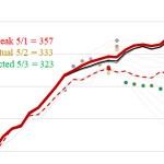
Misleading COVID-19 reporting deserves a very quick additional post before I step away from work for the day. Rhode Island’s news media is reporting 17 more COVID-19 deaths, which sounds like a lot, and if you look at the chart produced by Eli Sherman of WPRI, you can see why:
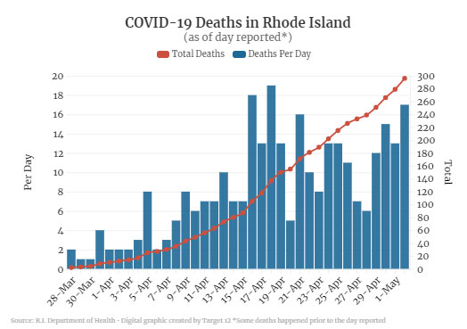
Seventeen deaths would make yesterday the third deadliest day in Rhode Island, and it looks like after a slowdown during mid-to-late April, we’re now on the upswing again. That’s not accurate, though. Note the parenthetical subhead saying “as of day reported,” with a tiny footnote explaining that “some deaths happened prior to the day reported.”
So what would this chart look like if we used the state’s actual day-by-day data?
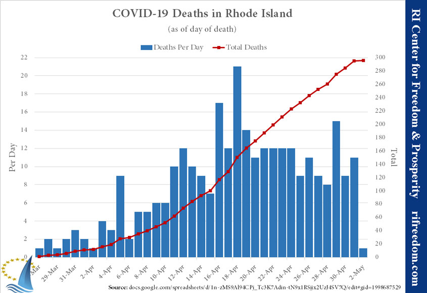
That makes a huge difference. The corrected chart tells a very different story — one in which deaths were accelerating to a peak in mid-April, followed by a plateau and even some slowing. As a basic practice, if you’re going to show data associated with dates, get it as close to what people expect it to represent as you can.