Strange Days for Employment Data
Today’s “employment situation” release from the U.S. Bureau of Labor Statistics (BLS) presents what might be termed a mixed-but-still-tepid picture best summarized with this quotation:
Employment growth has averaged 157,000 per month thus far in 2012, about the same as the average monthly gain of 153,000 in 2011.
That’s not much of an improvement, and it’s not nearly enough to speak of anything like a healthy growth rate.
But a reasonable analysis, teasing out as much election-season politics as it is possible to do, has to admit the peculiarity of the report. Payroll employment — which derives from a survey of businesses about the number of employees that they have (later to be adjusted for actual tax-form data) — was up 171,000 in October, following 148,000 in September. The peculiarity comes with the employment/unemployment numbers, which derive from surveys of the public.
The headline unemployment rate is 7.9%. The fact that that’s up a tenth of a percentage point from last month’s 7.8% isn’t necessarily a bad thing. Seasonally adjusted employment was up 410,000; the unemployment rate increased because the labor force (employed plus those looking for work) was up 578,000.
A few months of such results would indicate an improving employment market, as people who had given up begin to see signs of hope that they can find jobs and therefore move back into the labor force. On that interpretation, it could also be hopeful news that the long-term unemployed number went up and involuntarily part-time workers went down. It could be that people who haven’t worked for a long time are looking again and more of those whose hours were reduced are back to full time.
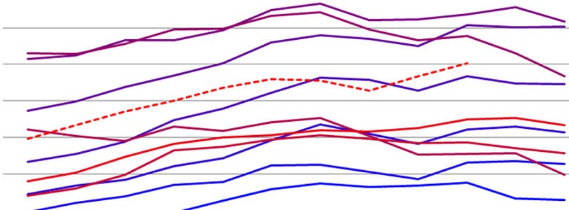
Still, the numbers are strange. The unprecedented leap in September employment has been neither revised nor explained. The following two charts show the employment numbers (to avoid the complications of labor force and unemployment). The first is seasonally adjusted and the second is not seasonally adjusted, meaning that it shows the actual results of the survey without the statistical manipulation that highlights long-term trends.
The bluer the line, the older the data; the redder the line, the newer. This year is hashed.


The lines illustrate perfectly what the underlying numbers show: Following on inexplicable results last month, October’s employment increased at a rate not seen since the housing boom. Neither the payroll data nor the general information available through the news media give the impression that the United States is experiencing such improvement.